Posts

Showing posts from April, 2010

Job Losses in New York City Documented by Subway Ridership Map

The New York Times has created an interactive map showing the gains or losses in subway ridership over the past year. The maps shows a graduated symbol on each subway stop and provides a tool tip indicating the stop, the increase or decrease in ridership and the number of average daily riders. Most striking, as pointed out in the article, is how you can map the areas hit hardest by the economic recession. It should serve as an invaluable tool for the NYC transportation authority as well as urban planners. But, unfortunately, it displays the tragic effects of a job losses and the potential impact upon the individual local economy around each subway stop.
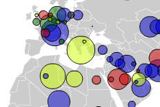
Chinese Investments in Raw Materials Mapped by Forbes.com

Image
Forbes.com created a graduated symbol map (see thumbnail at right) of the investments that the Chinese have made in various raw material sectors such as energy, minerals, and transportation. The interactive map illustrates: the accelerated growth in the number of investments made over the past five years the size of each investment the industry sector Tool tips appear as you hover the cursor over each symbol that shows: the investor the amount of the investment when the investment was made the industry sector What is striking about the portrayal of the data is not the size so much as the rapidity with which the investments have been made over just the last two years. If you watch the animated sequence, you will see how many of the investments were accomplished just recently. The feeding frenzy for raw materials is what is driving infrastructure growth throughout the Mainland.

West Virginia Coal Mine Explosion: Mine Maps Offer Challenges to Average Reader

The New York Times published both a 2D map and 3D topographic perspective map of the coal mine disaster in Montcoal, West Virginia where 25 miners were killed. Maps should provide some context and while the Times does a good job of showing the basic location of the disaster, they ignored a few cartographic principals. First, the 2D map has an inset map to give the reader the general location of the disaster. Unfortunately, the boundary shown in the inset map does not match the boundary of the mine area on the 2D map itself so it's hard to correlate the two maps. Second, the 3D map shows the topography and a satellite image overlay depicting the surface of the mine as well as a map of the subsurface mine layout. However, the mine layout boundary should be projected onto the 3D topographic map so that the reader understands the surface extents. Over on USA Today , their map is solely to locate the mine with a "pin." They do not offer supporting maps of the subsurface a