Posts

Showing posts from March, 2009

Satellite Image of North Korean Rocket Worries Japanese

Image
The satellite image from DigitalGlobe's Quickbird satellite shows a three-stage rocket on the launch pad at North Korea'sv Musudan Ri. The image was released by DigitalGlobe and Reuters and published in many newspapers including Japan's Mainichi Daily News .

Malaysian Voting Results

The Star , a Malaysian newspaper, provides details on election results in the country by showing a map of poll results .

Wall Street Journal Map Shows Banks are Lending in Many Metros

Today's front page of the Wall Street Journal shows a map of how lending by banks has increased in many metro areas during Q4. Leading the way is my hometown of Huntsville, Alabama. The maps shows the increase in loan balances, an indication that some banks are lending and that the cash crunch has not strapped all municipalities.

Shrinking Wealth

Forbes published (March 30 issue) a map depicting the loss of wealth among the world's billionaires. The thematic map shows the total losses among all billionaires in each country. The online map is a little hard to read so Forbes provided an interactive "magnifying glass" to see the results of each country. As interesting is the number of countries without millionaires and to see which countries did not suffer to many losses. Bill Gates remains the richest man in the world even though his net worth dropped $18 Billion!

Super Bowl Twitter Chatter

It was bound to happen...a map of Twitter chatter . Several have been created so far. But the New York Times has put together a map of tweets during the Super Bowl between the Pittsburgh Steelers and the Arizona Cardinals. And it has an interactive timeline...push PLAY and watch the volume of tweets change as the game progresses. There is a legend that indicated certain categories of tweets such as the name of players or tweeted emoticons. Now, the jury is still out as to the value of Twitter, but as a social network, it's gaining lots of followers.

Living on Earth: Mapping Climate Change

WBUR in Boston hosted a segment for the "Living on Earth" show call Mapping Climate Change . The program interviewed Josef Kellndorfer, a researcher at Wood Hole Oceanographic Institute. It's nice to see the press giving a nod to remote sensing.

CIO Magazine: 15 Must See Images from Google Earth

Thanks to a tweet from Dave Sonnen, CIO Magazine published the " 15 Must See Sights from Google Earth ." Now, the images are pretty cool, but what would possess the magazine to focus on geospatial technology, or are they just looking for pretty pictures? Unfortunately, I think the later is true as the caption above the series of images encourages the reader to be an "armchair explorer" if not a world traveler. I think this is all too often the case when those in the mainstream media offer up eye-candy to readers and miss the true value of geospatial technology.

USA Today's Map Shows Housing Construction Shift Back to City

USA Today published a map (Google Map-based) highlighting the cities that have seen a growth in construction projects located in or near city centers indicating a shift away from traditional suburban development. Was it the high gas prices of last summer, the economic downturn or something else?

British Sub Bases: Off Limits?

Several media outlets published the Google Earth Imagery of the Royal Navy's submarine base. FOX News showed a variety of angles taken with satellite imagery. What's your opinion? Should supposedly secret military bases be off-limits to the peering eye of commercial satellites?

New York Times: Immigration Explorer

The New York Times has published an excellent interactive map of immigration patterns from the late 1800's until 2000 showing the migration of immigrants across the U.S. as well as the percentage of each group, region of origin, and where they settled. The county level detail map has tool tips showing the current total population from the U.S. Census as well as the population of foreign born residents. A slider bar allows the viewer to focus on a certain time period (in tens of years) and a drop down box allows the viewer to select a specific nationality of origin. Have fun playing with this one...it's one of the best interactive maps the NY Times has created.

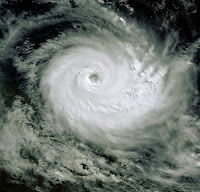
ENVISAT Satellite Image Shows Wrath of Cyclone Downunder

Image
A European Space Agency ENVISAT satellite image of Tropical Cyclone Hamish graced the entire front page of Brisbane, Australia's The Courier Mail today showing the magnitude of the storm. The image was enhanced by Earth Snapshot and what a fantastic image it is. The detail of the cloud patterns is particularly crisp.

Sometimes You Just Need a Map to Get the Whole Picture

Earlier in the day, I read the details of a story in my local paper about how the pilot of a U.S. Navy FA-18 Hornet crashed into a home, killing four people, while trying to land his hobbled aircraft last December. Today's San Diego Tribune however re-created the tragic accident with a map showing the flight path of the jet fighter that had taken off from an aircraft carrier but developed engine trouble. The pilot had the option of landing at a facility away from residential areas but wanted to fly the craft to Miramar Air Station...but didn't make it. I was wondering what the flight path was and trying to imagine what happened. The Tribune's map provided the necessary graphical detail...as only a map can.

Mapping L.A.'s 87 Neighborhoods

The Los Angeles Times has launched an interactive map called " Mapping L.A. " and features informaiton on its 87 neighborhoods. According to the times, the website was developed with Django, OpenLayers, and PostgreSQL and the data is based on the 2000 U.S. Census. But according to the Times, the map will be somewhat dynamic: "Because L.A. is always changing, Mapping L.A. will change with it. As communities gain in size or importance, or diminish, we’ll reflect those changes in these maps. But, in contrast to the past, the boundaries we recognize today will not be lost. Every time we move a city block from one community to another, we’ll keep a record of the original map that can be republished any time it’s needed. We’ll also keep a log of changes on the site for use by anyone seeking to trace the city’s evolution. " There is not much additional information there but the boundaries themselves, but it's a start. Perhaps they will add hyper-local news feeds?