Posts

Showing posts from January, 2009

Seattle Times: No Earthquake Map?

As we reported last July, The Seattle Times now has a " Mapping the News " page up on the website for local news stories. It is a Google Maps powered application that sorts by day and location. Looks like they used the Google Maps API and their dateline to post the news items. It's odd though that for today particularly with a minor earthquake striking the region that that isn't referenced. Only the epicenter is noted on the page with their story but I found it strange that more news about the quake isn't posted to the Mapping the News page. They have links to other references about the temblor but I expected more at their online portal. But the Times is better at it than the Post-Intelligencer which has no maps at all!
Unemployment Picture Not a Pretty Sight for any State

The Wall Street Journal published an interactive map by U.S. state showing the year-over-year unemployment trend for December. They've tied the map to a line graph of unemployment figures from each of the preceding months of December back to 2004. Other months can be selected as well and the map will change accordingly. Other, full year-over-year figures can be displayed as well, also back to 2004. They've done a good job with this implementation. However, the version published in the print edition is extremely hard to interpret as it shows unemployment by state as a thematic map in shades of gray. I can distinguish four shades; but not the five shades of gray used in the map.

Geographic Search Engine for News

A South African company, Muti , has indexed news by geography based on Yahoo Search called News Map . It uses Google Maps as a reference so that the user points to the map and a sidebar displays the search results. The news is not located by any designated "pin map" but if the user zooms in to more localized areas the search is sufficiently indexed to display news by a finer resolution of geography. According to the company: * Clicking on a country/region retrieves news about that country. * Switch quickly (edited) to another continent by clicking on the continent links in the header. * Zooming in one level will retrieve news at the state/provincial level. * Currently state level news is available for US, Canada, UK(Home Nations) and Australia. * Zooming in a second time will retrieve city news for large cities. * Over 3000 large cities are in the database. * Zooming out again will retrieve news at the respective level. This should not be confused

CNN Tracks its Journalists

During the U.S. presidential campaign, CNN was using their "magic map" for more than just election results. The were also using Skyhook Wireless technology to track their reporters as they followed the candidates. Skyhooks hybrid positioning technology (Wi-Fi, GPS or cellular) is embedded with iPhones and the reporters were displayed on King's "magic map". Watch the video demonstration by John King.

CNN Runs Satellite Image of Inauguration Parade Route

Just in case you didn't know exactly where President Barack Obama is, CNN ran a satellite image as a small strip at the bottom of the screen during the inauguration parade showing the location of the motorcade as a small blue dot and a "radar-like" circle "pinging" the location. I think that's going a bit overboard but, hey, satellite images are the hot thing right now. What can I say. CNN also has some initial images created using Photosynth from the inauguration ceremonies capturing " the moment ."

Media Tunes Up Mapping Apps for Inauguration

Several media outlets have published online map resources for the Inauguration of Barack Obama: The Wall Street Journal has posted a mashup of the location of inauguration events, balls, and attractions in addition to the inauguration parade route (thanks to the Google Maps & Earth blog for pointing this out.) The New York Times has a nicely done perspective view map that includes 3D building models set as a time sequence of events starting with the procession to the swearing in ceremony at the Capitol and completing the view along the parade route. USA Today has done a very thorough job with their map of including 3D building information, 360 IPIX imagery, and the locations of first aid, video screen locations throughout the Mall area, and security. The BBC has a static set of maps and aerial photos of Washington but it does have the location of the restricted streets and closed roads for the city center set up due to the parade. And, as reported in All Points Blog , CNN,

Time Magazine Map of Israel/Palestinian Region Leaves Many Questions

I like detail in maps but too often the media leaves it to the oft-times, geographically illiterate reader to figure it out. Time Magazine, in its January 19th issue (page 30), published a map of the Israeli/Palestinian conflict that provides information (or not) on the locations of Palestinian communities, the occupied territories procured during the 1967 Six-Day war and Gazan refugee camps. The map is quite detailed and based on information from the U.N. Office for the Coordination of Humanitarian Affairs . [Don't bother looking on the U.N.'s website for these maps as it will just confuse you.] But there are problems in interpreting the map. 1. While the Time Magazine map shows a nicely detailed thematic of the Palestinian communities, there are two shades of tan delineating these areas but the legend shows only one shade. Why two shades? For more of an explanation, I had to do a lot of digging. The lighter shades are considered under full Palestinian Authority control. The d

Cincinnati Enquirer Maps News, Crime, Traffic...and Everything Else

Image
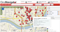
Thanks to Paul Overberg of USA Today , who sent a comment to our Directions Magazine article on " Crime Wave Mapping ," for pointing me to the Cincinnati Enquirer's CinciNavigator , a web mapping application that locates news, crime reports, traffic...you name it...in a single portal. CincNavigator uses a Microsoft Virtual Earth platform that is customized nicely to allow the user to isolate activities by date so as not to clutter the map. However, the tool tips as you mouse over each pin location have a way of obscuring some of the other information. The tip advises the user to zoom into the area and that's necessary to truly see incidents at a larger scale. But, overall, they have done an outstanding job with this portal.

Journalism Prize Awarded to Journalist Where Interactive Mapping Used

I am going to repost here an email from my good friend in Denmark who sent me information about the Calving journalism award that was given to a project where an interactive map was a significant part of the story: Cavling Prize for journalism with interactive map Berlingske Tidende receive on Friday Cavling prize for "crimes". This makes the most prestigious prize in the Danish media world this year given to a project where an interactive map has played a pivotal role. The card has been used to visualize cases from across the country in which the police did not respond to citizen inquiries. In some cases it has acted on human lives. Some examples are found for journalism research, but most cases come from readers who have been invited to submit information. Along with classic investigative journalism with documented examples of police failure, the story has been questioned by the reforms made by the Danish police. Police top commander has been dismissed and politicians will

Time Magazine: Mapping Energy Efficiency State by State

Image
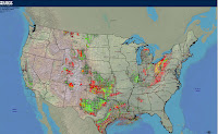
Which states encourage the most energy efficiency? Time Magazine has a basic prism map showing those states that do it best (see the Jan. 12 issue, page 34-35; the online article does not display the map unfortunately). What's interesting about this map is that you could pair it with those states with the most energy resources (see map at right from the U. S. Geological Survey's map of oil and gas exploration and production in the U.S.) and there is almost a 1 to 1 correlation with the exception of California, and there, their energy production is balanced with an enormous population. The south is particularly poor at encouraging energy efficiency mostly because energy is cheap (TVA and proximity to gasoline refineries). The midwest has lots of resources and places like Wyoming, the lowest ranked state, has an abundance of coal. Texas seems to have struck some balance but big oil can't last forever. Just ask T. Boone Pickens.

Wall Street Journal - Mapping Bank Failures

Image
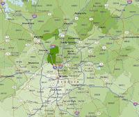
Maps don't usually appear on the front page of the "Money and Investing" section of the Wall Street Journal which is why this map of the latest bank failures caught my eye this Friday morning. The map shows the locations of those banks that failed in the Atlanta metro area and in particular in the suburb of Alpharetta. The map was a little hard to decipher unless you are aware of this particular grouping of suburbs which happen to be some of the wealthiest areas of central Georgia. I've attached here a map of the Average Household income (2004 Census data from Microsoft MapPoint 2006). The WSJ map is by ZIP code although this was not noted in the map caption (a failure I hate to see in a respected publication). So, the basic implication here, regardless of the underlying premise of the article which was the simple number of failures is that these banks are failing in some of the highest income areas of the state if not the country.