Posts

Showing posts from October, 2008

New York Time Interactive Map for NYC Marathon

This Sunday, 40,000+ runners will run, jog, walk, and run again through the five Boroughs of Manhattan. The New York Times has prepared an interactive map of the race route along with location of places to watch the runners. The page that contains the map has two tabs: one for the race course itself and a second with tool tips of the location of places to eat along the course. But wait, no Carnegie Deli ? Come on! I know it's a block or two just off Central Park South but, gee, you gotta have it on the map!
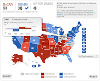
Chicago Tribune Wins "Tool Tip" Award for Election Map

Image
It's been fascinating to watch how varies publications offer their version of the U.S. presidential election map. At this point, it's almost a given that all of them will let you change the electoral count for each candidate. But the battleground now seems to be what ancillary data can populate the map or in the case of the Chicago Tribune , what the tool tip should show as you "mouse over" each state. The Tribune shows the historical margin of victory for the presidential candidate in past elections. They've made it easy by color-coding by the typical red vs. blue for each winning party. So, the result is a compelling tool that allows the user to determine how deep or shallow the margin of victory is and also provides some intelligence for looking at the current polls to determine if the party has a strong foundation.

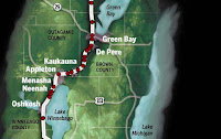
Milwaukee Journal Sentinel: Deadly Highway for Drunk Driviers

Image
The Milwaukee Journal Sentinel highlights the location of drunk drivers along U.S. Highway 41 between Milwaukee and Green Bay. The map is interactive in that the location of the accident provides details on the driver that was killed and in particular his blood alcohol level. It's a chilling and graphic example that should move transportation directors and politicians to act. That's what maps can do. You can have reams and reams of tabular statistics of drunk drivers and the location of their demise or you can have one map.

To the San Francisco Chronicle - Shades of Gray is the New Black

I'm in San Francisco this week for a conference and I picked up a copy of the San Francisco Chronicle , courtesy of my hotel. Now, I usually don't comment on something as mundane as the weather maps in newspapers but the Chrons' weather map of the Bay Area was so bad that I just couldn't pass up the opportunity. Hello Chron! I can't read your weather map...it's just...gray! There are no shades of gray...just light gray that is impossible to read...with a whole lot of text that is equally hard to read. I think they try to show terrain features but that's a wasted attempt. You can't distinguish roads from county boundaries. And then there are these oblong dots on the map to show air quality. Again...just gray; not a graduated symbols which would be a marked improvement...no, no, they went for a gray dot. Here's a suggestion. Use color, cut down on the number of cities listed, and try to accentuate the geographic boundaries. If you want to show air qua

Christian Science Monitor Offers Psychographic Patchwork

Image
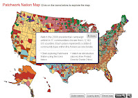
The Christian Science Monitor (CSM) is offering a unique Patchwork Nation Ma p that profiles the psychographic characteristics of potential voters at a county level. The map is not a predictor map or electoral vote maps like others but tries to classify the U. S. into 11 " community types " based on age, ethnicity, education, and income status. Obviously, these class types are more amalgamated groups than those offered by Claritas' PRIZM , Pitney Bowes' PSYTE , or ESRI's Tapestry lifestyle segmenation systems. Each grouping by the CSM map provides a town that serves as an example of each group. For example, Eagle, Colorado server as a representation of the "Boom Town" class. As for the map, the patchwork thematic favors pastel colors that are difficult to discern when compared to the legend. The map itself is fine but to match the thematic map to the legend color is problematic. If you choose the option to remove the county boundaries, you can begin to

National Geographic's MapMachine: Switch to Microsoft Virtual Earth

Looks like the National Geographic made a switch from using ESRI technology to Microsoft for their MapMachine . In 2001, National Geographic began implementing ArcIMS to create its MapMachine. In surfing, I noticed that they made a switch to Microsoft Virtual Earth. That's a huge change for the NG which had been loyal to ESRI for many years.

CBS News' Election Map: Not Even Trying

I guess CBS News decided to look at their competition and simply give up. There is a map and you can pick a winner for each state, but beyond that, the map is ugly, boring and uninformative. And for some reason CBS thinks that you'd want to embed this map into something as they give HTML code to do so. And it's not very up-to-date because as of today, it's last update was Oct. 10. CBS gives you the option of looking individually at swing states but the information is similar to what you can find elsewhere. In fact, that's where most readers should head.

Wall Street Journal's Election Map - More History Than Most.

The Wall Street Journal's election map is not much different than others I've profiled. However, I did like the rollover tips that described the importance of each state. For example, Indiana has only supported a Democrat once in the last 50 years in the 1964 election of Lyndon Johnson. In swing states like Ohio, the WSJ gives brief mention about how the economy may swing the election toward Democrats. And if you are interested in tracking polls, I found the graph of the most reliable media polls to be useful. The graphs shows the latest polling trends over time since June for the U.S. or by individual state.

Boston Globe's "What If" Map of the U.S. Presidential Election

Image
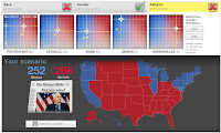
And now for something completely different, the Boston Globe's "What If" map for the U.S. Presidential election is perhaps my new winner in allowing the individual the most options in considering the outcome of the race. Using a variety of demographic variables including race, religion, and ethnicity, the user adjusts the percentage of the total turnout of these groups and to which candidate they would favor. Using a graph of turnout on the Y-axis and candidate "leaning" on the X-axis, the user moves the controls to assign their predictions. You can leave out any of these demographic factors or use all of them. You can default to the results of the 2004 election or in the case of ethnicity, use the exit polling numbers from 2006. There is basis for the graphs in the 2000 Census. The Globe has a succinct explanation of how the controls were create. So, try it and see if you can guess how the percentage of the Catholic vote would affect the election. What percen

Could the U.S. Election Result in a Tie?

The Washington Times published a map that shows how it is possible to arrive at a tie in the Electoral College. The source is Real Clear Politics and the graphic was created by the Dallas Morning News . However, CNN, after last night's debate, had Obama with 277 electoral votes, and the Real Clear Politics' current map shows Obama with a solid or leaning 286.

Precinct Maps Created From Voter Records

Image
For a while, I have commented on the fact that the media will need better geographic detail to more closely examine the geography of politics and in particular the precincts that will sway the vote in an election. Word comes from Farallon Geographics that they were contracted by National Committee for an Effective Congress (NCEC) to "complete the first multi-state, spatially-enabled GIS election precinct data set that covered almost a dozen battleground states." The work entailed compiling over 20 million voter records supplied by the Democratic National Committee. I've asked Farallon to supply more details on how the records were processed to define these precincts because as the graphic at right shows, the raw data is in the form of point records. Oracle Spatial was used to process the point data. Of course the other issue is what this point data represents? Are these actual voters and if so, is there an issue with privacy of these records? So, will the media get th

CNN Magic Map Showing Race Trending Toward Obama

CNN's John King provides the details on a shifting geographic trend on the "magic map" as the U.S. presidential race heats up. Embedded video from CNN Video

ABC TV Website Limits Map Capabilities to News Indexing

The map used by ABC News at their website is disappointing. It is used simply as a means to index the most recent ABC News stories from that state and provides only how the state is "leaning" in the presidential election. A tab on the map shows when ABC will visit the state to cover news there. That's just not news. And if they want to index their news geographically, I suggest they talk to MetaCarta and figure out a better way to use mapping technology.

ABC TV Goes Analog with Map Puzzle

As a kid, I had a puzzle of the U.S. Seems as if the producers of ABC TV had them too. As I watched ABC's The Early Show I wondered if they had taken a look at CNN's flat panel digital "magic map" and said to themselves, "Gee, I think we'll go in the opposite direction; no digital map for us...we'll use a puzzle!" Bad move. As I watched Harry Smith converse with a reporter from The New Republic about which states could move into the Democratic column this November, I couldn't help thinking this was a step "way backwards" from what other news media are using. Smith carried with him large puzzle pieces of the states of Florida, North Carolina and Virginia and placed them on an enlarged floor map on which they were standing. It looked awkward and anachronistic; something I would have seen from the days of Walter Cronkite. Come election night, ABC will have to think of a better way to display results if they want to keep up with their co

MSNBC Map Has Prediction, and County Level Contribution Data

Image
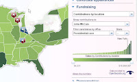
I like MSNBC's county level detail map on contributions by candidate. The supporting bar chart provides perspective to the level of spending as does the thematic map of each county on a state level basis. The map is supported by information on each candidate's campaign schedule in that state. MSNBC's map also allows predictions by the user like other media maps have done. Unique to the MSNBC map are the supporting demographics, simple population, age, race, education, etc. thematics from the 2000 census. It's a nice touch for basic research purposes. In addition, another nice touch is the ability to "magnify" the regions where the smaller states can be seen more clearly.

CNN Updates Map Calculator with New Results

CNN, in their coverage of tonight's debate, has updated their Electoral Map Calculator , putting more electoral votes in Senator Obama's column. John King, in an on-air analysis, looked at Ashland County, Ohio, as a key county that may swing the election in that state. I hope that CNN will update their map calculator to provide more geographic detail. County level detail just isn't cutting in anymore in their online map calculator; we need to see what CNN is seeing at this level of detail. If the election is going to be won or lost at the county level, then we need to understand the demographic composition at this level.

CNN Looks for Consensus with Poll of Poll Map

If you are looking for a map of consensus in the country during this presidential election season, take a look at CNN's Candidate Polling map that tries to aggregate polls taken across specific states. The polls were taken by certain media, research, or academic sources and each state will have differing questions asked. Look for this map to be updated after tonight's debate.

Find Your "Gossip Girl" Hangout

Even the entertainment media has found a use for internet maps and, to a degree, vicarious social networking. The New York Post has created an interactive map of cable TV channel CW's Gossip Girl program. So, if you are looking to see where Lucy stomps on ex-Rufus' heart modeling her wedding gown, then click on #43 on the map to see the location of the Vera Wang store on Madison Ave. The TV show is about the exploits of rich, preppy teens living on the Upper East Side of Manhattan. If you can get by the fact that this is a quasi-soap opera, the map is quite good. It familiarizes the user with the neighborhoods of Manhattan and they've done a nice job of pinpointing the location of various scenes of the program along with photos and notes from the show.

Fox News' New Political Map Leaves me BLANK!

Image
Fox News replaced their political map that I previously mentioned with a new interactive map that is so poorly conceived that it leaves me totally blank. In fact, most of the map is BLANK. Visitors to the website are confronted with a map of the US sitting on a background photo of the White House. There are no details associated with the map other than you can mouse over a state and, lo' and behold, you see...the name of the state! Then, as you click on a state, the only detail that you see are the county boundaries; everything else is just a blank map. Click on the county...again...blank. Try to drill down on the county...nothing. Data at the bottom of the screen reveals information from the 2004 presidential election only. There are no interactive tools to predict electoral vote counts like at other news media websites. There is no way to thematically map the red vs. blue states. A box at the bottom of the screen allows the user to insert your zip code. I tried and it brought me

New York Times Maps the "No" Votes on Bailout Plan

I have to admit I had to stair at the New York Times ' map that they created to show how the votes were cast in the U.S. House's vote "against" the financial bailout plan on Monday September 29. The thematic map of congressional districts showed how the "no" votes were cast and which party cast them; blue for Democrats; red for Republications; and gray for the "yes" votes. It was the thematic map of the "yes" votes that did not differentiate by party that was somewhat confusing because I wasn't sure if there was any attempt to do so. Obviously, though, it was the "no" votes that caused the market to crater dramatically and it was important to show which congressmen and congresswomen cast their votes accordingly. Was there any spatial pattern, any thread of commonality of the voting pattern? I couldn't find any. If you do, let me know what you see!